We collaborated on a multidisciplinary diagnosis about the accessibility needs for people with disabilities, at the four regional museums of INAH in Campeche (Museo de Arquitectura Maya Baluarte de la Soledad, Museo de Arqueología Maya Fuerte de San Miguel y Museo de Arqueología Maya del Camino Real de Hecelchakán y Museo de Arqueología Subacuática Fuerte de San José el Alto), that included the facilities’ assessment for physical access but also of contents and languages. Subsequently at El Gabinete we developed different tasks:
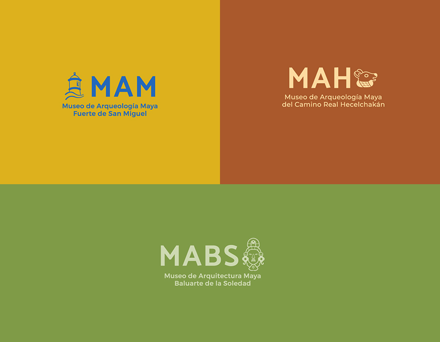
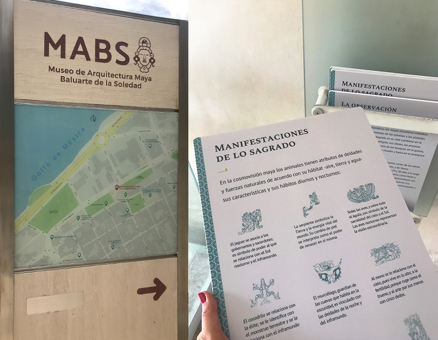
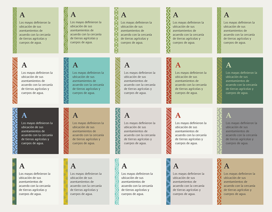
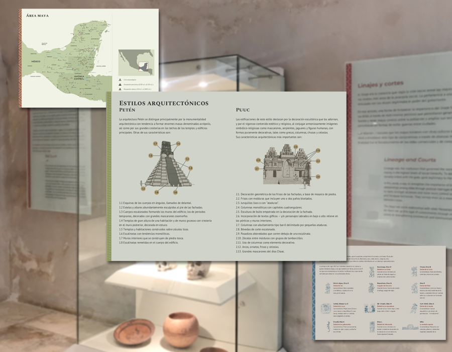
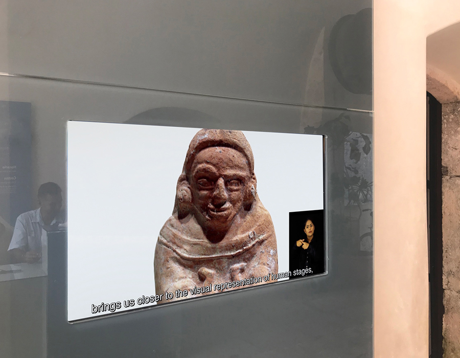
We designed the graphic line for three of the museums: logo, graphic and exhibition design applications’ manual, besides the signals with Braille and new graphic prints. For all four museums we produced the Welcoming videos narrated in Spanish, with English subtitles and Mexican Sign Language.
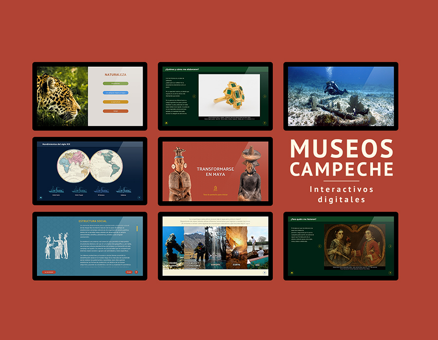
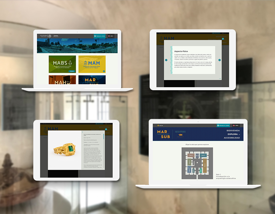
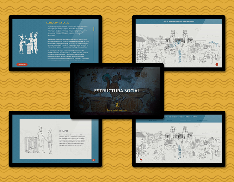
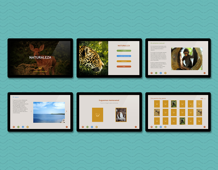
We developed seven interactive modules for different format touchscreens and a responsive website of the four museums with their respective galleries and services.
We made the User experience design and development for a mobile app ecosystem (for Android and iPhone). In this case, with the intention of not repeating information or competing with the website, we decided to create an app for a specific type of public: visitors with blindness and visual impairment, who usually find diverse obstacles when using public spaces particularly museums where they are supposed not to touch anything and there are risks to damage objects, a situation that creates a lot of stress on them which is why they are not frequent museum visitors. The exhibition design intervention of this project included on the scripts, some tactile stations or haptic modules that show replicas of some relevant collections for the visitor to touch. They also feature audio descriptions and videos with Mexican Sign Language.
In order to fulfill the objectives of an app for blind or visually impaired people, we knew it was fundamental to know the final users’ needs, so we made a series of interviews to blind people that revealed unsuspected data, for instance that they use their phones comfortably with the Accessibility tools already included on the operation systems, such as: Voice over, Magnifying glasses, Contrast, Color or Brightness change; which are fundamental in their daily lives. Technology and multiple apps in the market allow them to access (even faster than Braille) to many unavailable for them before. On the other hand, we understood that it was important to have features for people with visual remnants such as the possibility to distinguish color or contrast; another important data is that there are many people who are not blind since birth.
Having this in mind as well as other testimonies, we elaborated mind maps that related the content of each gallery and each one of its tactile modules, with the needs of the users. In this process we began to break our own paradigm and, thinking more empathically, we began to use our own devices as they do. Later on, it was clear that our app should take as much advantage as possible of the Accessibility options in each device system and focus our efforts in the development and content care.
The interface should be simple, with good contrast color, and navigation tools big enough and easily placed for location. We introduced a User Manual on the app’s OnBoarding, in a colloquial and kind language with curious data to awaken the interest of the general public.
The content (mainly in audio descriptions) is detonated through radiofrequency sensors installed in the galleries, commonly known as beacons; these send proximity alerts to the visitor to indicate the presence of tactile modules. Thanks to the Accessibility options en Android and IOS devices, many blind people use mobile technology in a similar way as people with normal vision; the app through Bluetooth, Voice over or Voice assistance guides the visitors from the entrance of the precincts to each one of the haptic modules.
Considering this, we applied a Universal Design criteria, so that anyone using the app: blind, visually impaired people, or with normal vision, may all acquire a broader panorama than the one they had before visiting the museum. The app also takes support on the audios located on the haptic modules and give deeper information of the themes and objects of each gallery.
Client
Domo Educativo / INAH Campeche
